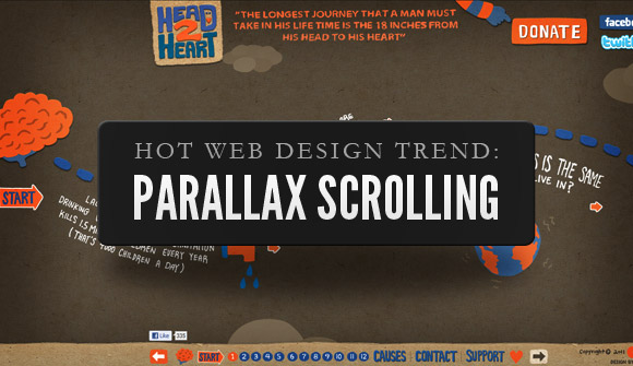
From soaring fad to mainstream trend, vertical scrolling bubbled throughout 2014 and with some splendid endorsement and attractive portfolios all benefiting from single page scrolling, it is now more than sure that this trend is here to stay. 2014 was the year when the web designers started taking control of this particular technique and this way they started pushing the boundaries of everything that could be achieved. You must be wondering what is actually left for parallax and vertical scrolling as we’ve now stepped in 2015. Although there will be certain perils of this system, yet this is indeed a technique that is going to stay for a long time. Have a look at some vertical scrolling trends that we might have already seen and that we may even predict for 2015.
- Numerous bad scrolling websites: From the tag to Flash to dancing bananas, every time a web designer animates the web, it ends up in vain. There’s probably an expectation that vertical scrolling could even move in the same manner. Creating such parallax sites are now much easier than what it was 2 years ago. There are tools and libraries that assist the amateurs to create scrolling sites with the minimum amount of coding knowledge that is usually needed.
- Approach towards mobile phones: It is expected that vertical scrolling may work well on mobile but that has never been the driving principle behind the popularity of such types of websites. This will change in 2015 as the way in which users consume online content will gradually change. With the introduction of iPad and the other Windows and Android devices, very few people are actually accessing their desktops and laptops to go online. Yet vertical design has always been a showcase of websites partly due to the CSS rules that are used for the parallax effects.
- Content has to be more substantive: With time, gradually there will be more significance of vertical scrolling as the technique gradually seeps in. Once again, there will be no contradiction to say that there can be an increase in usage of the best practice as there is more of the horrible stuff. For the users to get attracted to your website, you as a web designer, also have to be careful about the consistency and the substantiveness of the content.
- Very few cues: Previously, it was pretty common for the links to be flagged in here and there. But now according to Jakob Nielsen, hyperlinks should always be blue in color and they should always be underlined. Cues in vertical scrolling pages will start disappearing and it will become common to see buttons taking the users from one section to another.
Hence, if you’re a web designer who is about to set your career in 2015, make sure you take the above mentioned points into consideration. To know more on web designing, you may check outhttp://onestopcreates.comas you will get all designing solutions here.
Kidal Delonix is a contributor to Mr. Hoffman's blog. The views and opinions are entirely his/her own and may not reflect Mr Hoffman's views.


Learn more

Cannot decide which one you need - native or cross platform development tools? Let’s reveal who a true champion is. Today we’ll do our best to ...

The massive global shift in 2020 has completely upset the job market. Even if you were one of the lucky ones who were not made redundant, working ...

Making Sense of the Cape's One-of-a-Kind Water Issues Geospatial Perspective: Cape Cod Has Big and Bad Water Problems Cape Cod is a peninsula kn ...

There are many abstract and dramatic sounding tech-terms used to describe IT concepts, products and services that anyone outside of the IT industr ...

Social media has revolutionized the way we communicate, but it has also had a profound impact on our self-esteem and body image. Research shows th ...